A clearer, more structured way to present a complex product.
Saastock
,
Identity & Web
,
2025
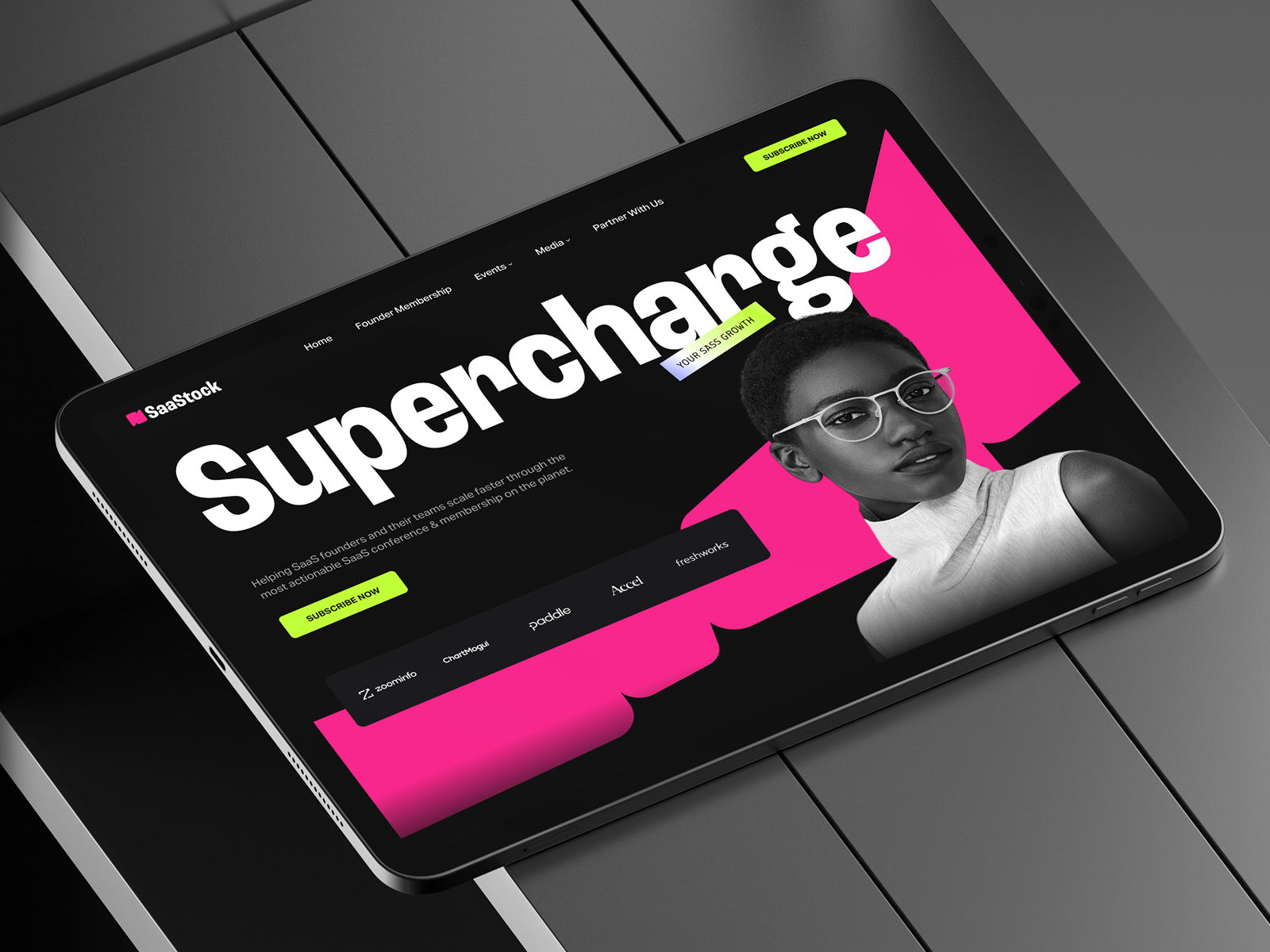
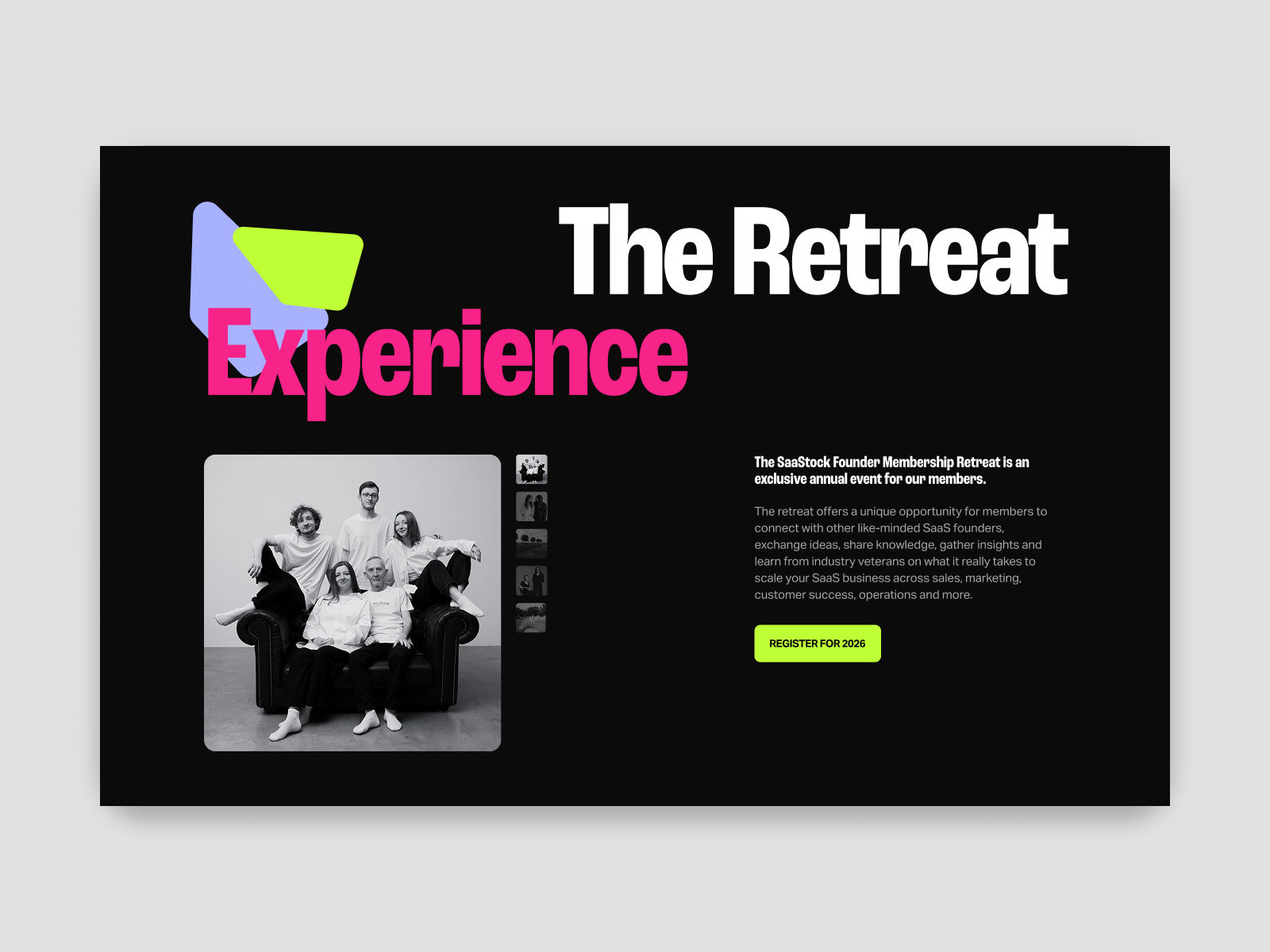
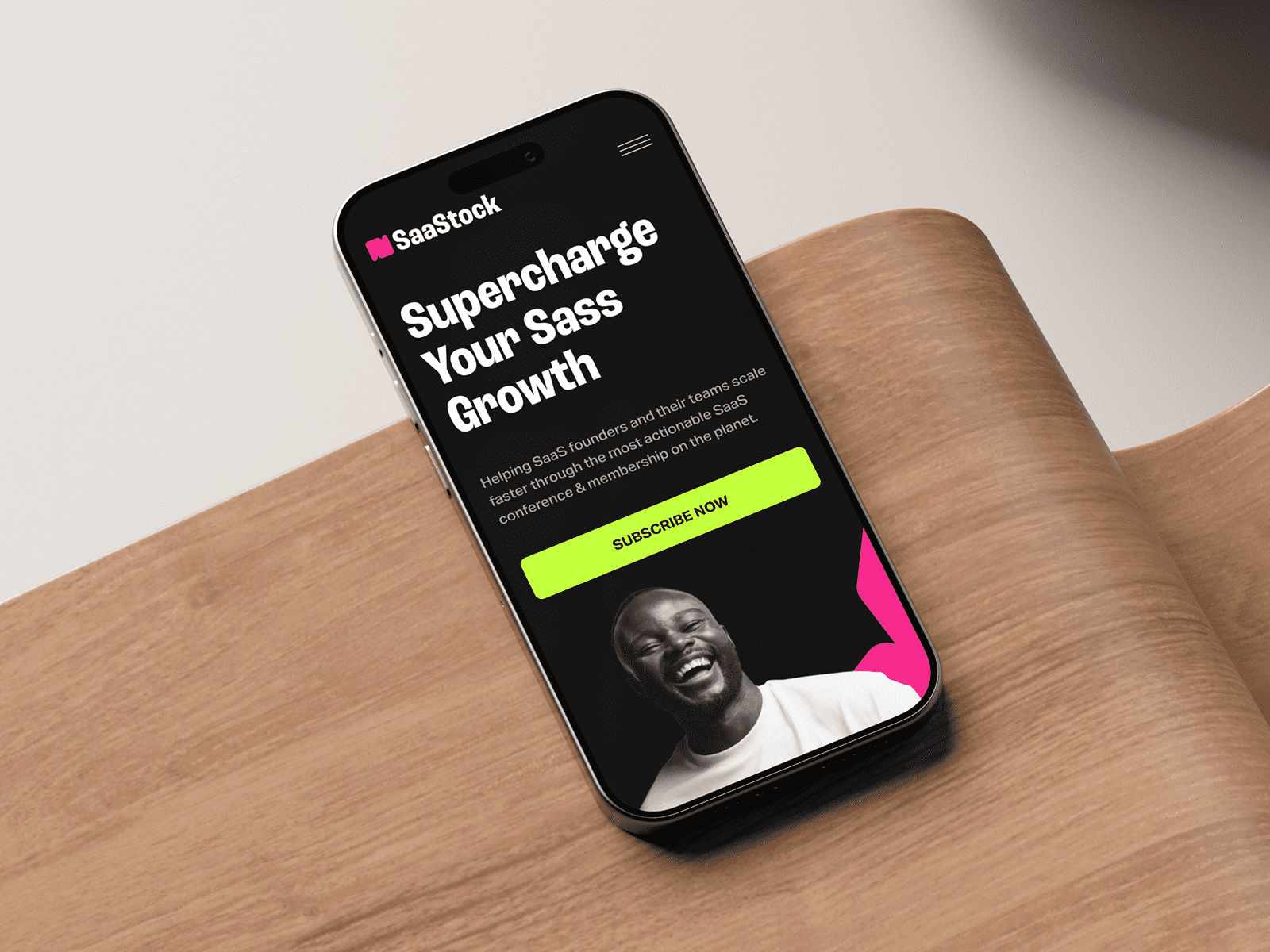
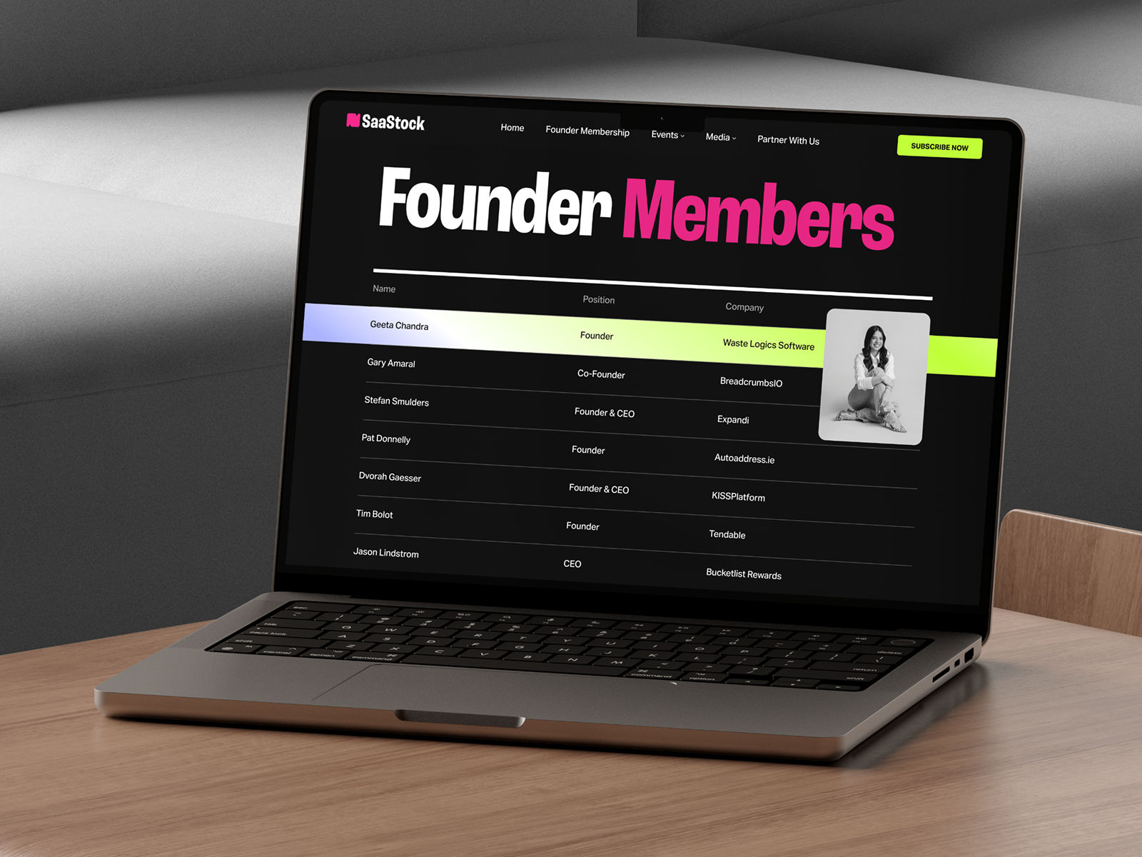
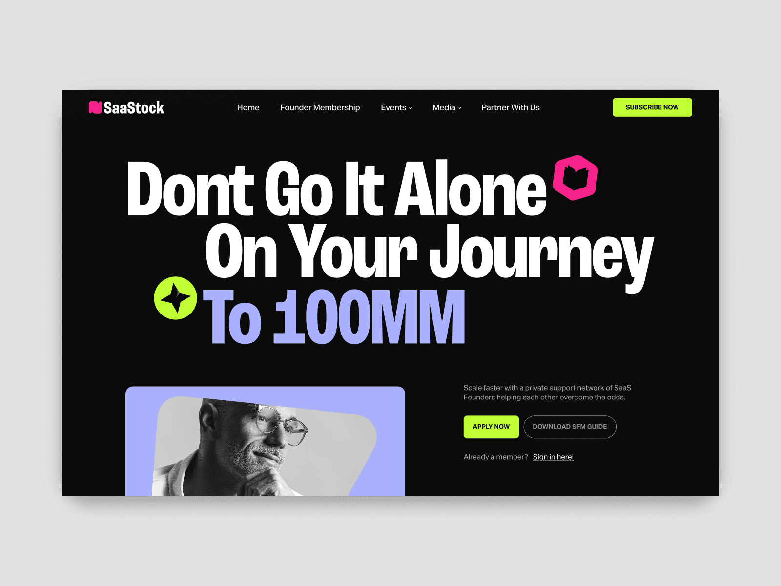
SaaStock is a B2B SaaS conference focused on founders, operators, and growth teams. The existing identity lacked structure — information around speakers, agenda, and content competed visually, making the experience harder to scan and navigate. We rebuilt the system around hierarchy and density. Typography became the primary organizing tool, allowing large volumes of information to be structured clearly without relying on decorative elements. The layout was reduced to a strict grid, prioritizing speed of access over visual noise. Across the website and supporting materials, the system emphasizes clarity at scale — making it easier to browse sessions, identify speakers, and understand the event without friction. The result is a more controlled and legible experience, aligned with the expectations of a technical and time-sensitive audience.

Message isolated to clarify the offer

Content segmented for faster scanning

Hierarchy tightened to reduce noise

Clarity preserved across screens

Founder data prioritized for quick scanning

Direct messaging to clarify the value quickly

Content reduced to highlight the core action

System extends consistently across physical touchpoints
SaaStock brings together founders, events, and content under a single offering — but the value wasn’t immediately clear. The system was restructured to remove that ambiguity, clarifying what the product is and how it should be understood from the first interaction.
Saastock
,
Identity & Web
,
2025
SaaStock is a B2B SaaS conference focused on founders, operators, and growth teams. The existing identity lacked structure — information around speakers, agenda, and content competed visually, making the experience harder to scan and navigate. We rebuilt the system around hierarchy and density. Typography became the primary organizing tool, allowing large volumes of information to be structured clearly without relying on decorative elements. The layout was reduced to a strict grid, prioritizing speed of access over visual noise. Across the website and supporting materials, the system emphasizes clarity at scale — making it easier to browse sessions, identify speakers, and understand the event without friction. The result is a more controlled and legible experience, aligned with the expectations of a technical and time-sensitive audience.
Message isolated to clarify the offer
Content segmented for faster scanning
Hierarchy tightened to reduce noise
Clarity preserved across screens
Founder data prioritized for quick scanning
Direct messaging to clarify the value quickly
Content reduced to highlight the core action
System extends consistently across physical touchpoints
A clearer, more structured way to present a complex product.
Goldcast
,
Identity & Web
,
2025
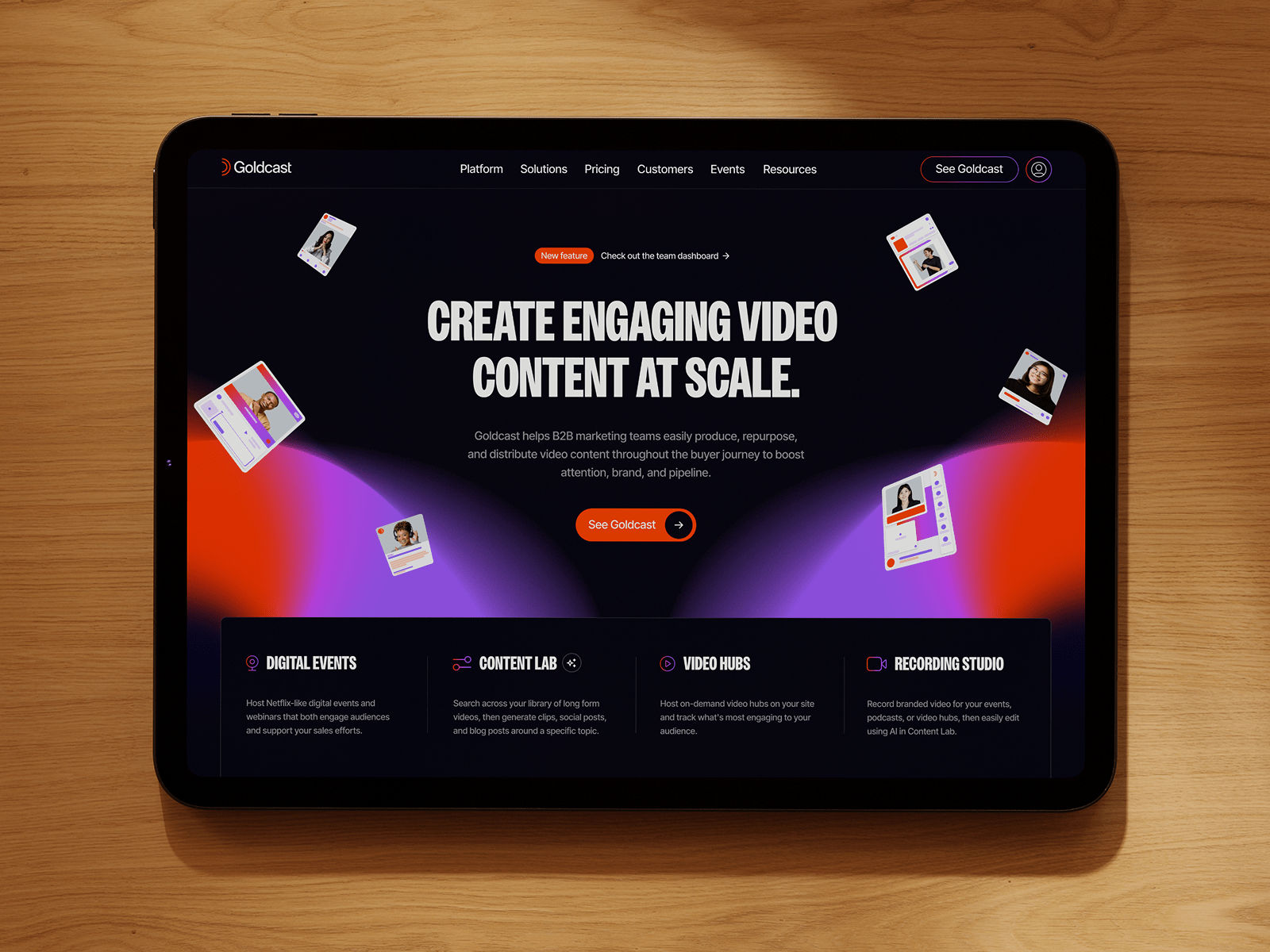
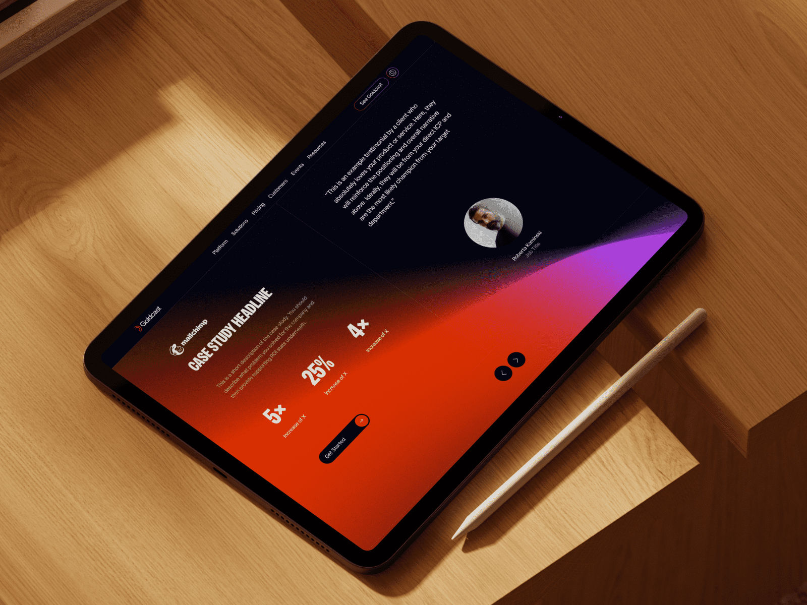
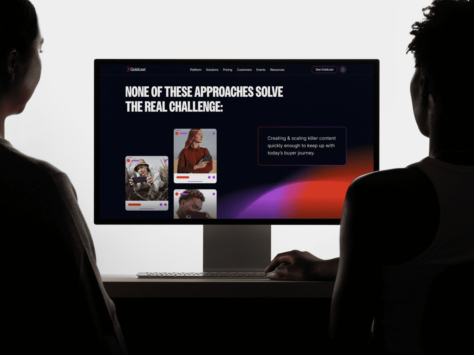
Goldcast operates as a multimedia platform focused on digital creators and distributed content. The initial identity lacked definition — it tried to balance experimentation and clarity, but the system wasn’t consistent enough to scale across different formats and touchpoints. We approached the system as a flexible framework rather than a fixed identity. Core elements were reduced to a small set of rules that could adapt across campaigns, artist features, and merchandise without losing coherence. Typography and layout were used as the primary structure, allowing the system to shift in tone while maintaining a recognizable voice. Variability was introduced intentionally, but always within controlled limits. The result is an identity that supports range without becoming unstable — expressive when needed, but anchored by a consistent underlying logic.

Motion drives the initial interaction

Interaction structured around content flow

Data surfaced to support key points

Content layered without losing clarity

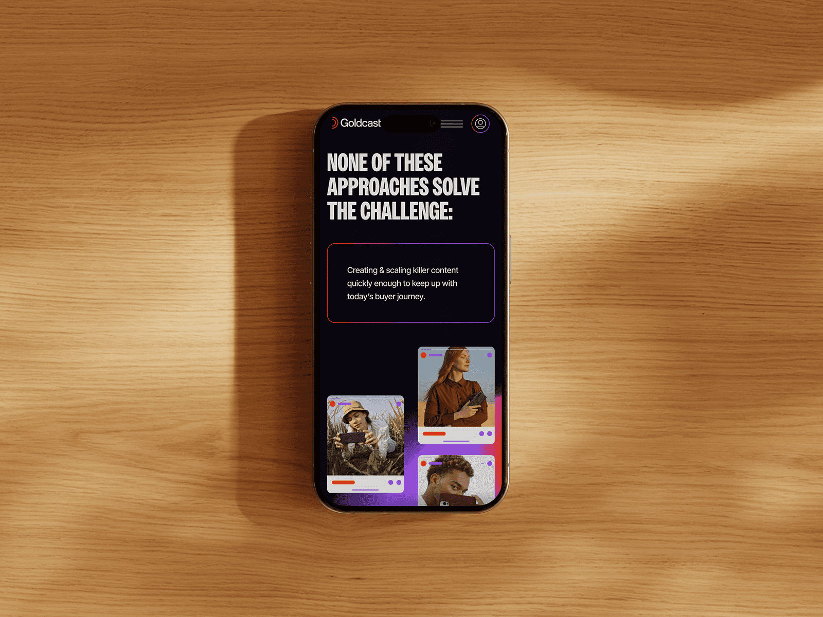
The core problem is made explicit

Message holds on smaller screens

Product surfaced within the experience

Key insight brought forward
Goldcast is a video-first platform built around content and distribution — but much of that value wasn’t immediately visible. The system was simplified to surface that value, making the product easier to understand across the experience.
Goldcast
,
Identity & Web
,
2025
Goldcast operates as a multimedia platform focused on digital creators and distributed content. The initial identity lacked definition — it tried to balance experimentation and clarity, but the system wasn’t consistent enough to scale across different formats and touchpoints. We approached the system as a flexible framework rather than a fixed identity. Core elements were reduced to a small set of rules that could adapt across campaigns, artist features, and merchandise without losing coherence. Typography and layout were used as the primary structure, allowing the system to shift in tone while maintaining a recognizable voice. Variability was introduced intentionally, but always within controlled limits. The result is an identity that supports range without becoming unstable — expressive when needed, but anchored by a consistent underlying logic.
Motion drives the initial interaction
Interaction structured around content flow
Data surfaced to support key points
Content layered without losing clarity
The core problem is made explicit
Message holds on smaller screens
Product surfaced within the experience
Key insight brought forward
A clearer, more structured way to present a complex product.
Profit Labs
,
Identity & Web
,
2025
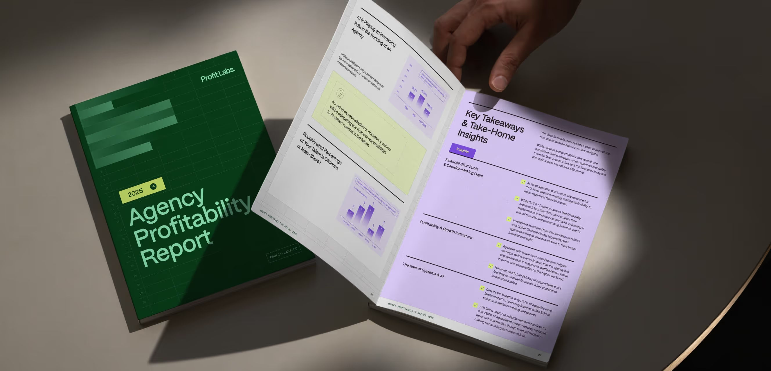
Profit Labs operates as a performance-focused platform built around measurement, reporting, and operational visibility. The initial identity lacked clarity — complex data and multiple features were presented without a clear structure, making the product harder to interpret and trust. We reduced the system to its essentials, using typography and layout to establish a strict hierarchy. Information was reorganized to surface key metrics first, while secondary elements were contained to avoid visual noise. The identity was built to support clarity at scale — ensuring dashboards, marketing pages, and supporting materials could communicate consistently without becoming dense or fragmented. The result is a more controlled and legible system, where data is easier to read, navigate, and act on.

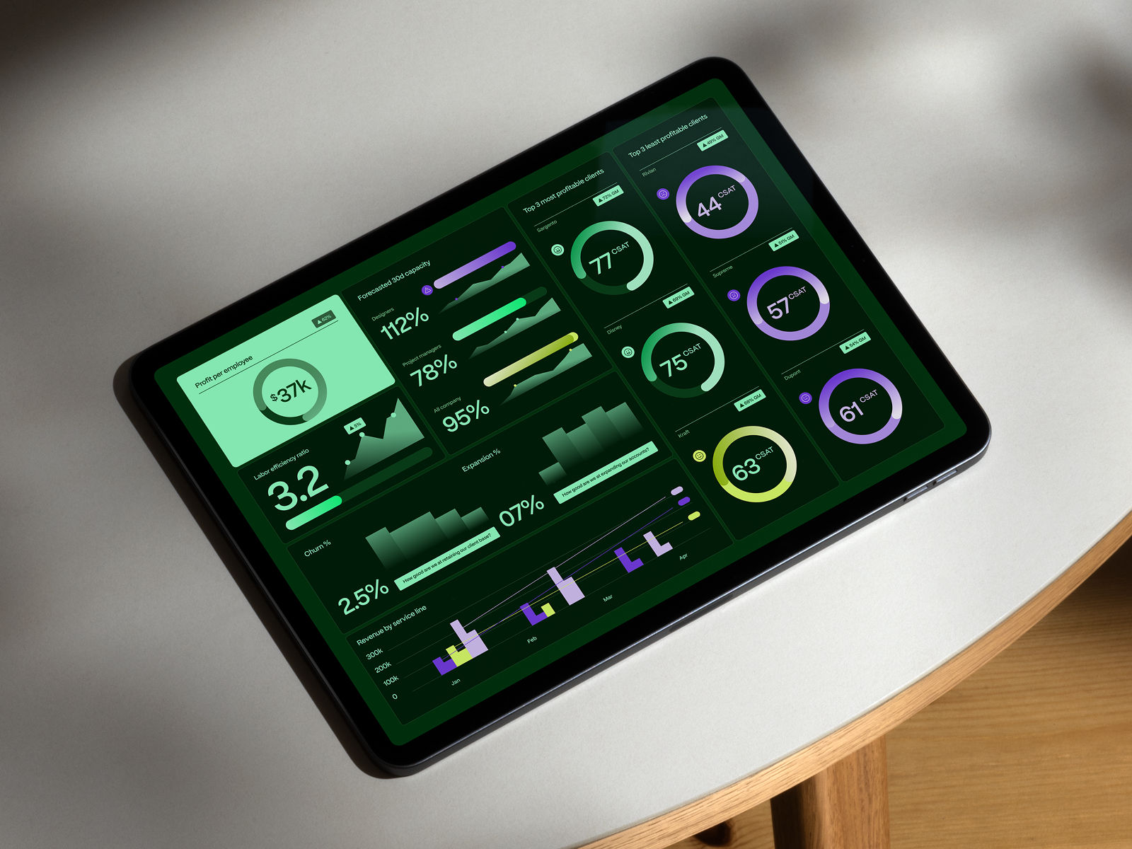
Complex data, clarified
System in motion

Identity as system

Insights, made actionable

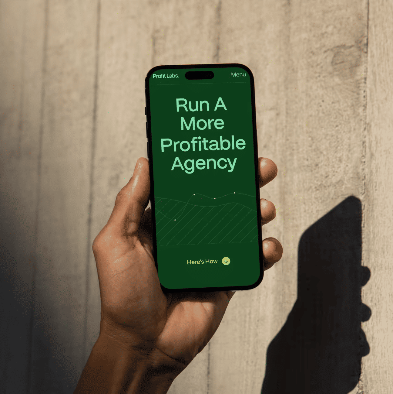
Clear value proposition

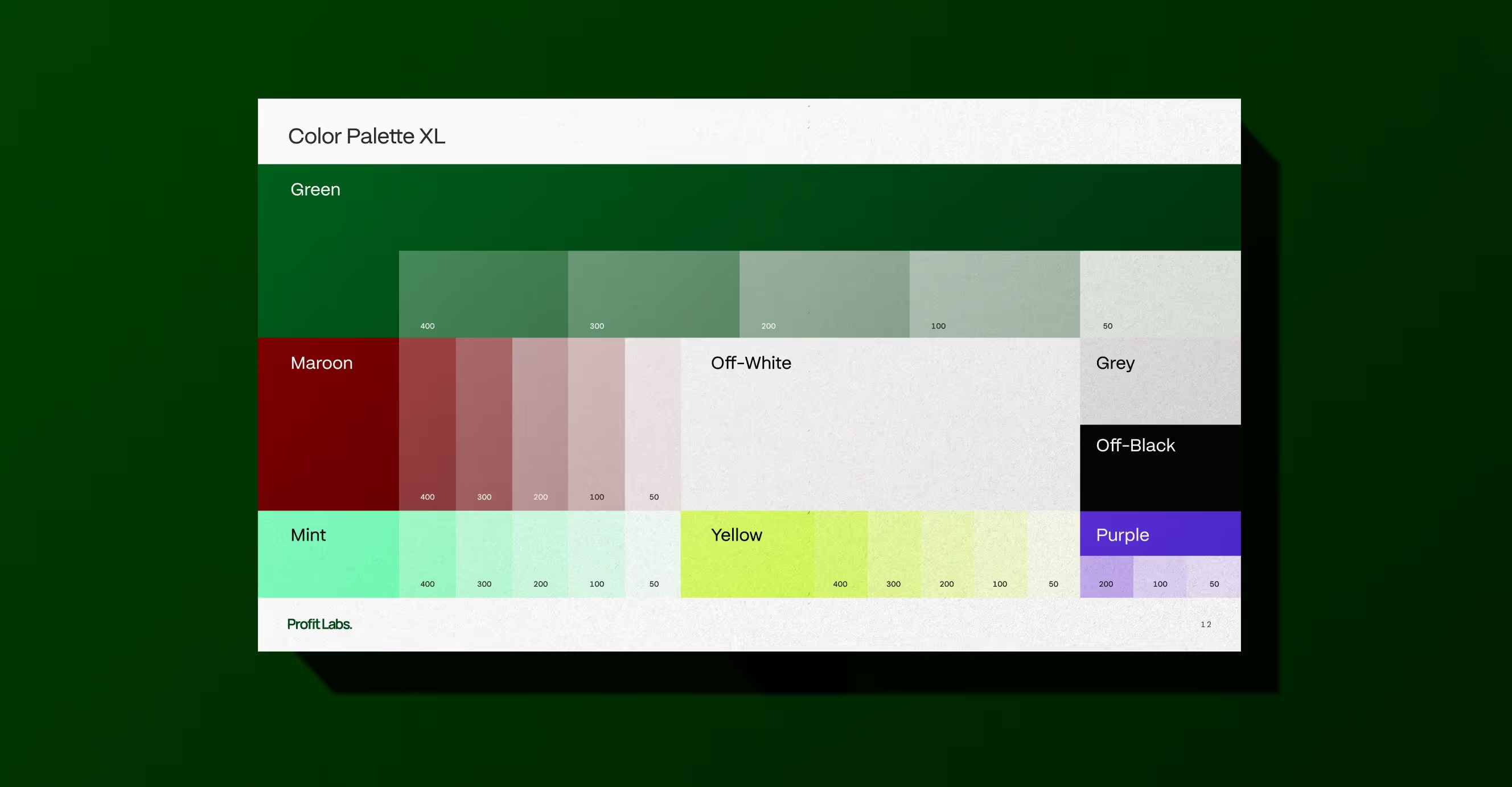
Color as system

Login Introduction reduced to essentials

Brand beyond the interface
Profit Labs works with dense financial and operational data for agencies, where clarity is critical but often lost in complexity. The system was restructured to make that information usable, supporting decisions instead of overwhelming them.
Profit Labs
,
Identity & Web
,
2025
Profit Labs operates as a performance-focused platform built around measurement, reporting, and operational visibility. The initial identity lacked clarity — complex data and multiple features were presented without a clear structure, making the product harder to interpret and trust. We reduced the system to its essentials, using typography and layout to establish a strict hierarchy. Information was reorganized to surface key metrics first, while secondary elements were contained to avoid visual noise. The identity was built to support clarity at scale — ensuring dashboards, marketing pages, and supporting materials could communicate consistently without becoming dense or fragmented. The result is a more controlled and legible system, where data is easier to read, navigate, and act on.
Complex data, clarified
System in motion
Identity as system
Insights, made actionable
Clear value proposition
Color as system
Login Introduction reduced to essentials
Brand beyond the interface
A clearer, more structured way to present a complex product.
Luca
,
Website
,
2025
For Luca, a lifestyle and eyewear brand, we were brought in to design a digital experience that balanced product detail with aspirational storytelling. The client wanted to position themselves at the intersection of fashion, tech, and culture. Objectives included building a responsive site with a bold editorial layout, integrating product showcases, and delivering an elevated customer journey that reflected their modern luxury sensibility.

LUCA_01.JPG

LUCA_02.JPG

LUCA_03.JPG

LUCA_04.JPG

LUCA_05.JPG

LUCA_06.JPG

LUCA_07.JPG

LUCA_08.JPG